
It is Friday afternoon, and a manager needs the latest sales report before a meeting. The raw export has arrived, but it still needs cleaning, totals, charts, and a dozen copied figures across separate sheets. Someone opens last month’s workbook and begins the familiar sequence of copying, pasting, filtering, and hoping nothing was missed.
This is exactly the kind of recurring work that an Excel VBA dashboard can reduce. A well-designed dashboard does not merely make a worksheet look polished; it turns a repeatable reporting process into a controlled workflow.
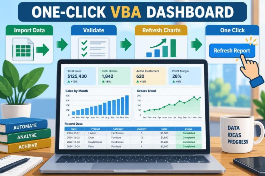
With one button click, VBA can import or refresh data, validate key fields, update calculations, rebuild pivots, refresh charts, apply formatting, and record what happened. The goal is not to automate every decision. It is to automate the predictable steps so people can spend their attention interpreting the results.
Building that system takes more thought than recording a macro. The most dependable dashboards start with a clear reporting process, a tidy data structure, and VBA procedures that are designed to cope with ordinary changes in real files.
🎯 Define the Reporting Job Before Writing VBA
Begin with the business question the dashboard must answer. A monthly revenue dashboard, for example, may need revenue by region, product category, and salesperson, plus a comparison with a target and the prior period.
Write down the inputs, transformations, outputs, and user actions. If the process is unclear on paper, code will only hide that uncertainty behind a button.
- Inputs: exports, entered assumptions, or connected workbooks.
- Transformations: cleaning dates, assigning categories, calculating totals.
- Outputs: KPI cells, charts, pivot tables, and a report sheet.
- User action: one visible Refresh Report button.
🧭 Map the Current Manual Workflow
Watch or perform the report process once from start to finish. Note every manual action, including small ones such as removing blank rows, changing number formats, or checking whether the export used the expected headings.
Separate necessary judgment from mechanical repetition. VBA is excellent at consistent, rule-based tasks. It cannot reliably decide whether an unexpected drop in margin is a genuine business event or a source-data problem without rules that you define.
A simple process map also reveals dependencies. For instance, a chart should update only after its underlying summary table or pivot table has been refreshed.
🏗️ Choose a Workbook Architecture That Can Grow
Keep raw data, calculations, dashboard presentation, and configuration separate. Mixing all of them on one sheet may work for a short prototype, but it makes maintenance difficult when the report evolves.
| Sheet or component | Purpose | Typical user access |
|---|---|---|
| Dashboard | KPIs, filters, charts, and the refresh button | Read and interact |
| Data | Imported or pasted source records | Usually hidden or protected |
| Calc | Helper formulas and summary logic | Limited access |
| Config | Paths, report periods, targets, and settings | Administrator access |
| Log | Refresh history and error information | Review when needed |
This structure makes it easier to find faults. If a KPI is wrong, you can trace whether the issue started in the source data, calculation layer, or display layer.
🗂️ Make the Source Data Tabular
A dashboard is only as dependable as its source layout. Use one row per record and one column per field. For a sales report, each row might represent one invoice line or one completed transaction.
Avoid merged cells, decorative title rows inside the data range, subtotals between records, and blank columns used as visual separators. Those choices make data pleasant to view but unreliable to process.
Convert the range into an Excel Table, often called a ListObject in VBA. Tables expand with new rows, retain column names, and provide a stable object for formulas, pivots, and code.
🏷️ Use Stable Names Instead of Cell Coordinates
Code that refers to Range("B2") may break when someone inserts a row. Prefer named ranges for important settings and tables for structured data.
For example, a named range called ReportMonth communicates its purpose far better than an unexplained cell address. Likewise, tblSales is more resilient than guessing the last populated row in column A.
Names are not a replacement for good code, but they reduce “magic numbers” and make procedures easier for the next maintainer to understand.
🔌 Decide How New Data Will Arrive
There is no single best import method. The right choice depends on where data originates, how consistent it is, and what users are allowed to access.
- Paste into a table: simple and transparent for small, controlled datasets.
- Open a selected workbook: useful when an exported file changes each reporting cycle.
- Query or connection: suitable for repeatable external sources, though it needs setup and access management.
- CSV import: practical for common system exports, but delimiters, dates, and encodings require testing.
Do not hard-code a personal file path such as a desktop folder into the macro. A file picker or configurable shared location is usually safer.
🧹 Clean Data With Explicit Rules
Imports often contain inconsistent capitalization, extra spaces, text stored as numbers, or dates that Excel interprets differently from the source system. Define what “clean” means for your report rather than applying broad changes blindly.
For example, trimming leading and trailing spaces from a region name may be sensible. Replacing all hyphens or converting every text value to uppercase may destroy meaningful codes or labels.
Keep cleaning routines focused and test them against a copy of representative data. If source cleanup becomes extensive, document the rules so report users understand how reported values are derived.
✅ Validate Before Updating the Dashboard
A one-click process should fail safely when essential input is missing. Before overwriting the report, check that the source has required headers, contains records, and includes values that can be interpreted as dates or amounts where required.
Validation is not about rejecting every unusual record. It is about preventing a misleading report from being presented as current.
Private Function HasRequiredColumns(tbl As ListObject) As Boolean
    On Error GoTo MissingColumn
    Dim testColumn As ListColumn
    Set testColumn = tbl.ListColumns("Date")
    Set testColumn = tbl.ListColumns("Amount")
    HasRequiredColumns = True
    Exit Function
MissingColumn:
    HasRequiredColumns = False
End Function
Tell users what failed and how to fix it. “Missing Amount column” is actionable; “Run-time error” is not.
🧮 Build Calculations in the Right Layer
Use worksheet formulas when users benefit from seeing and auditing the logic. Use VBA when the task involves coordinating workbook actions, transforming records, or applying conditional steps that formulas would make unwieldy.
For example, a SUMIFS formula is often ideal for an auditable category total. VBA is useful for clearing old imported rows, loading new values, and refreshing a set of pivots afterward.
A hybrid design is often strongest: formula-driven business calculations in structured tables, orchestrated by a VBA refresh procedure.
📌 Design KPIs for Decisions, Not Decoration
A key performance indicator should tell the reader something useful at a glance. A large number with no context is rarely enough. Pair a current value with an appropriate comparison, such as target, prior month, or year-to-date value.
Choose measures that match the audience. Executives may need revenue, margin, and target variance; an operations team may need open workload, turnaround time, and exceptions.
Label units clearly. If one card shows currency in thousands and another shows raw units, say so directly. Ambiguous scales cause avoidable misinterpretation.
📈 Select Charts That Match the Question
Charts should shorten the path from data to interpretation. Use line charts for movement over time, bars for comparing categories, and stacked charts only when both total size and composition matter.
A pie chart can show a small number of simple shares, but it is difficult to compare many similarly sized slices. If precise comparison matters, a sorted bar chart is usually clearer.
Keep titles specific: “Monthly Revenue, January–June” explains more than “Sales Chart.” Remove visual clutter that does not help interpretation, including unnecessary 3D effects and dense gridlines.
🧩 Use Pivot Tables for Flexible Summaries
Pivot tables are a practical engine for many Excel dashboards because they aggregate large tables without requiring every summary to be built by hand. A pivot can summarize revenue by month and region, while a pivot chart visualizes the result.
Base each pivot on a stable Excel Table rather than a fixed range. When the table expands after import, the pivot source remains aligned with the data.
Use calculated fields cautiously. For ratios such as margin percentage, calculate from aggregated components when possible, rather than averaging row-level percentages that may have different weights.
🎛️ Add Filters Without Creating Confusion
Slicers, timeline controls, and data validation lists can make a dashboard interactive. They also create state: the visible report depends on the current filter selections.
Make active filters obvious. If a user filters the dashboard to one region, the title or status area should reflect that selection. A report that looks company-wide but is actually filtered is a common source of errors.
Decide whether your refresh button should preserve filters or reset them to an agreed default. Either behavior can be valid, but it should be deliberate and communicated.
🖱️ Treat the Button as a Workflow Entry Point
The visible button is only the front door to the process. Label it clearly, such as “Refresh Monthly Report,” instead of “Run Macro.” Place it where users naturally begin, usually near the dashboard title or report controls.
Assign the button to one public procedure that coordinates the refresh. Avoid asking users to run several macros in a particular order; that simply relocates manual risk.
A short status message during longer updates helps users understand that Excel is working rather than frozen.
🧱 Break the Macro Into Small Procedures
A single macro containing hundreds of lines is difficult to test and risky to change. Create one main procedure that calls smaller procedures with clear responsibilities.
Public Sub RefreshReport()
    PrepareApplication
    On Error GoTo HandleError
    ImportData
    ValidateData
    RefreshSummaries
    UpdateDashboard
    WriteLog "Refresh completed"
CleanUp:
    RestoreApplication
    Exit Sub
HandleError:
    WriteLog "Refresh failed: " & Err.Description
    MsgBox "The report was not updated: " & Err.Description, vbExclamation
    Resume CleanUp
End Sub
This pattern makes the sequence visible. It also allows you to test ValidateData or UpdateDashboard independently.
⚙️ Manage Excel Settings Carefully
Turning off screen updating, events, or automatic calculation can speed up a refresh. However, these are application-wide settings, not just cosmetic choices. If code crashes before restoring them, Excel can appear broken afterward.
Always restore settings in one cleanup path, whether the procedure succeeds or fails. Store original values if the workbook may be used alongside other workbooks with different settings.
Performance matters, but predictable recovery matters more. Never leave users with calculation accidentally set to manual.
🛡️ Add Error Handling That Protects the Report
Error handling should do more than display a message. It should prevent partial updates from looking complete, restore Excel settings, and preserve enough information to diagnose the issue.
Where practical, load and validate new data before clearing the existing report data. This reduces the chance that a corrupt import leaves the workbook empty.
Use targeted error messages around expected risks, such as a missing selected file or an absent worksheet. Do not suppress errors broadly with On Error Resume Next; it can hide failed actions and create silent inaccuracies.
📝 Keep a Refresh Log
A simple log adds accountability without making the dashboard complicated. Record the date and time, user name if appropriate, source file name, record count, and final outcome.
When a reader asks why a number differs from yesterday’s version, the log provides a starting point. It can also reveal that a report was refreshed with an unexpectedly small export.
A log should support troubleshooting, not become a storage bin for sensitive source data. Record only what is useful and permitted in your environment.
🔒 Handle Security and Trust Sensibly
Macro-enabled workbooks need a macro-enabled file format, commonly .xlsm. Many organizations restrict macros because malicious code can be embedded in workbooks, so users may see security warnings or be unable to run the dashboard.
Use trusted distribution methods approved by your organization. Never tell users to bypass security controls just to make a workbook work. Digital signing, trusted locations, and controlled sharing may be options depending on local policy.
Worksheet protection can prevent accidental edits to formulas or layouts, but it is not a substitute for access control or secure data handling.
👥 Design for the Person Who Did Not Build It
A dashboard succeeds only if another person can refresh and interpret it without the author standing nearby. Include a concise instruction area with the expected source format, refresh steps, and what to do if validation fails.
Use descriptive sheet names, named controls, and readable procedure names. A future maintainer should be able to answer “where does this number come from?” by following a reasonable trail through the workbook.
Consider using a small Config sheet for settings that may change, such as the expected source folder, threshold values, or report period, instead of burying those values in code.
🧪 Test Normal Cases and Awkward Cases
Testing with one clean export is not enough. Create a small set of test files that represent realistic variation: no records, an extra unused column, blank dates, duplicate rows, a changed header, and unusually large data volume.
Check both numbers and behavior. Does the macro restore settings after an error? Do charts show the correct period? Are old rows removed before a smaller new dataset is loaded?
Keep a known-good expected result for a test dataset. Comparing your dashboard output against that result catches regressions after code changes.
🚫 Avoid Recorded-Macro Fragility
The macro recorder is useful for learning object actions, but recorded code often selects sheets and cells before acting on them. This makes it slower and more fragile because it depends on the active workbook and current selection.
Prefer direct references such as Worksheets("Dashboard").Range("B5").Value, ideally qualified with the workbook object as well. The code then states exactly what it intends to change.
Also avoid fixed end rows like 5000 unless a fixed template truly requires them. Tables and calculated last rows adapt more gracefully as exports change.
📅 Control Dates, Periods, and Refresh Timing
Dates are a frequent source of dashboard mistakes because systems can export dates as text or use regional formats differently. Convert and validate dates deliberately, especially when importing CSV files.
Make the reporting period visible on the dashboard. If the dashboard shows year-to-date data through a selected month, display that month prominently so readers do not assume it is current through today.
A refresh timestamp is useful, but it does not prove the source itself is current. If possible, show both the refresh time and the latest transaction date in the imported data.
🔍 Reconcile Key Totals Before Publishing
Automation can reproduce a wrong rule very efficiently. Build one or two reconciliation checks between the dashboard and a trusted control total from the source system or export.
For example, compare imported sales total and row count with stated figures from the source file when they are available. If the difference exceeds an acceptable business-defined tolerance, stop and ask for review rather than updating the polished dashboard.
Reconciliation is especially valuable after source-system changes, when an apparently familiar export can have a subtle change in meaning or granularity.
📦 Keep Versions and Changes Manageable
Save a backup before significant structural changes, especially before changing import logic or formulas. VBA code can be exported as modules for backup and review, while workbook copies protect formulas, layouts, and named ranges.
Add a visible version label and maintain a brief change note. This is useful when several people circulate copies and someone reports a problem that only appears in an older version.
Avoid editing the production workbook directly during a deadline. Test changes in a copy with representative data, then move the approved update into the shared version.
⚡ Know When VBA Is Not the Best Tool
VBA is well suited to desktop Excel workflows, structured workbook automation, and teams that already use Excel as their reporting environment. It is less suitable when many people need simultaneous browser-based editing, when data volumes exceed practical workbook limits, or when source data needs robust scheduled integration.
Power Query can be a better fit for repeatable data shaping, while database queries or dedicated business intelligence tools may be more appropriate for centralized reporting. These tools can also work alongside VBA rather than replacing it entirely.
The best solution is the one that fits the process, support skills, data scale, and governance requirements—not the one with the most automation.
🧠 Build in Stages Rather Than Automating Everything
Start with a minimum useful dashboard: a reliable import, a few verified KPIs, one or two charts, and a refresh log. Once that works repeatedly, add filters, exception checks, or richer visuals.
Incremental development keeps failures understandable. If you automate data cleanup, pivot refresh, chart formatting, and PDF export all at once, it is much harder to identify which part caused a bad result.
After each stage, ask users whether the dashboard changes a decision or merely adds visual activity. Keep features that improve clarity, speed, or control.
📋 A Practical One-Click Refresh Sequence
A dependable refresh generally follows a predictable order. Your details will differ, but the sequence prevents dependent tasks from running too early.
- Confirm the workbook is ready and preserve application settings.
- Obtain the source file or refresh the connection.
- Load data into the source table.
- Validate headers, record counts, types, and key totals.
- Refresh formulas, queries, pivots, and charts.
- Update titles, timestamps, and dashboard status.
- Write a success or failure entry to the log.
- Restore settings and show a clear completion message.
This is what “one click” should mean: one deliberate action that runs an understandable, controlled process—not a mysterious black box.
🏁 The Core Principle: Automate the Process, Not Just the Clicks
The strongest Excel VBA dashboard is not defined by flashy charts or the length of its macro. It is defined by trustworthy inputs, explicit rules, visible status, and a refresh sequence that handles normal changes and understandable failures.
Start with a clean table, separate the workbook into sensible layers, validate before displaying results, and write VBA in small procedures that can be tested. Add logs, reconciliation checks, and clear user guidance as the report becomes more widely used.
When the process is designed well, the button becomes the simplest part of the system. It gives users speed without asking them to surrender confidence in the numbers.
A one-click Excel VBA dashboard earns trust when it makes recurring reporting faster, clearer, and easier to verify—not merely more automatic. 📊⚙️✅